I adhere to the Seven Contrasts of Color as put forth by Johannes Itten (November 11, 1888, Südern-Linden, Switzerland - March 25, 1967, Zürich, Switzerland) who was an instructor at the Bauhaus.
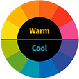
1). Hue Contrast: Observed differences designated by name such as Red, Yellow, Blue, Green, Orange, Violet, etc. Value Contrast: Light to Dark. The range of Black through the Gray Scale to White or any color tinted with White or toned with White and Black or Shaded with Black. Gradation is a beautiful use of this contrast but it is also applicable using the other 6 contrasts. It is preferable to use more White abstaining from using Black to achieve a more luminous color palette. Some artists have refrained from using Black altogether preferring the intermixing of the three primaries (Red, Yellow, Blue) to achieve a Dark, almost Black Gray. However, Franz Kline used Black and White almost exclusively to aclieve the most wonderful, powerful abstract gestural paintings in existence. Temperature Contrast: Cool to Warm Colors or Cold to Hot Colors, ex., (Cool Red-Violet to Warm Yellow-Green) — (Cold Blue to Hot Orange). Warm colors come forward while cool colors recede. Warm colors placed on the convex area of a body and cool colors placed on the receding shadow side of a form create an object or abstract form as seen in depth. A hot Orange shape placed on a cold Blue field is perhaps the strongest, most intense color contrast of all. Complementary Contrast: Opposites on the Color Wheel —
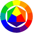 
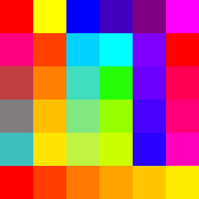
the most intense color contrast. There are 3 primary colors on the color wheel; (Red, Yellow, Blue). These 3 are the purest of all colors; no colors can be mixed to create any of these 3 colors and in fact, all other colors on the color wheel are produced by mixing 2 of these 3 together. — All color harmony hinges on this; remove 1 of the 3 primary colors, Red, Yellow, Blue, ex., (Red) isolated from the opposing complementary combination of remaining 2 primaries, (Yellow and Blue when mixed resulting in Green, the complement of Red) and with intermixing of White into all of these color combinations results in a broad range of Color Hues, Values, Temperature, Simultaneous, Saturation and of course the Complementary Contrast, indeed the main applicable color contrasts. The Complements Blue - Orange are the most intense Temperature Contrast, the Complements Yellow - Violet are the most extreme Value Contrast on the color wheel, and the Complements Red - Green are, perhaps, the most intense Contrast in Vibrance, possibly because they are the same in Value, and the 3 primaries Red, Yellow, Blue are the most intense Hue Contrasts. The 3 secondary colors are Orange, Green and Violet resulting from the equal mixture of 2 of the primaries; (Red and Yellow = Orange), (Yellow and Blue = Green), and (Blue and Red = Violet). The 6 tertiary colors and their Complements are (Yellow-Orange — Blue-Violet), (Red-Orange — Blue-Green), (Red-Violet — Yellow-Green) which result from the named primary being dominant in the mixture of the 2 primaries. Simultaneous Contrast: When colors affect each other Simultaneously in different regions of the color wheel, in such a way that they appear to become more pronounced. It refers to the way a color appears to shift in Hue, Value or Intensity when placed next to another color. A small neutral gray square of the same Value placed on top of a larger square of any of the pure colors in the color wheel appears to lean toward the complement of the pure color upon which it was placed. A muted Red like Burnt Sienna with a smaller muted Gray-Green patch placed on top of the Burnt Sienna Simultaneously increases the optical chroma of both the Red in the Sienna and the Green in the Gray-Green. Michel Eugene Chevreul first postulated this phenomenon of Simultaneous Contrast of Colors during the lecture he gave on this subject at the French Academy of Sciences on the 7th April, 1828. Successive Contrast: Happens in the brain of the viewer when one stares at a Saturated color for a while and then looks away, the opposite color on the color wheel appears in a sort of visual mirage in the same shape and size. This occurs because the photoreceptors in the eye become fatigued, causing the brain to compensate by producing the opposite hue. Saturation Contrast: Intense Color to Muted Color; the intermixing of all colors from the most intense being the highest in Saturation, to the most subtle, being the least Saturated. The intermixing of all three primaries results in a desaturated, almost Black Neutral Gray. When one or two of the primaries are in higher quantity, the Gray becomes a Reddish Gray with a higher degree of Red; or Bluish Gray with a higher degree of Blue; or a Violet Gray with a higher degree of Blue and Red mixed with the Yellow. Further, mixing White with all three primaries in varying proportions produces a huge variety of subtle colors, including Red-Gray, Yellow-Gray, Blue-Gray, Orange-Gray, Green-Gray to Violet-Gray in all their various tints, tones, shades, and Saturations ad infinitum. A more concrete and elucidating example is Salmon; resulting from 52% Red, 36% Yellow, 12% Blue. This contrast also requires the greatest effort in honing one's skills in the mixing of colors and requires the greatest degree of observational acuity. When mixing colors, it is necessary to have two versions of each of the three primaries; a warm version and a cool version: Cadmium Red and Magenta Red; Cadmium Yellow and Lemon Yellow; Cerulean Blue and Ultramarine Blue, respectively. - Cad. Red mixed with Cad. Yellow creates an intense Orange. Cerulean Blue mixed with Lemon Yellow creates an intense Green. Ultramarine Blue mixed with Magenta Red creates an intense Violet. - Cad. Red and Cerulean Blue create a muted Gray Violet. Cad. Yellow and Ultramarine create a dirty muted Green. Lemon Yellow and Magenta create a muted Burnt Orange. While these colors are preferred under certain circumstances, there are times when the purest secondary and tertiary colors are preferred and or required. I even have both versions of the secondary and tertiary colors. And an extra-large tube of white is always a prerequisite. Extension Contrast: Contrasts of proportion and placement of colors in spatial relationships, and Focal Point(s) optically inducing movement. Itten used Goethe's theories to explain how the area of a color can influence its perceived strength. A dominant color is the one that appears in the largest area and influences the overall feeling of the piece. It refers to the balance of colours in proportion to their intensity, placement, and area, as well as to Quality and Quantity in color theory.
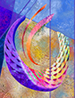
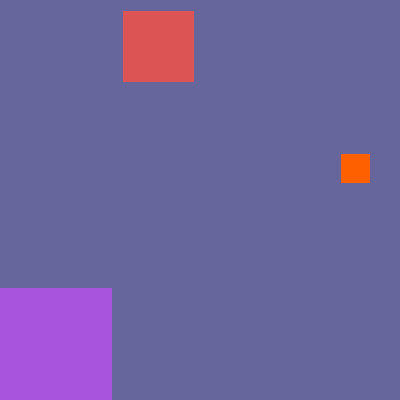
An example of Focal Points is starting with a Cool Bluish Gray field upon which are placed a large Light Lilac square at the bottom left - a medium-sized Light Red square placed at the top left just off center, and a small Brilliant Orange square placed just above the horizontal center to the far right. The Blue Gray field is the dominant color because it occupies the largest area. But the Brilliant Orange does 2 things. Being the Complement of Blue, the Blue Gray Simultaneously appears to be a more intense Blue surrounding the Orange and the Orange Simultaneously appears to be even more intense relative to the Blue Gray. Being the strongest color contrast, the eye immediately focuses on the small Orange square as that is the main focal point. Next, the eye will move up to the Light Red square and finally down to the Lilac square, their placement inducing movement.
Extension-Saturation-Focal Points:
The Quality of a color refers to the intensity or purity of a Hue. It describes how vivid or dull a color appears, indicating how much of the other two primaries it contains. Higher Quality means a more intense, vibrant color, while Lower Quality indicates a duller, more muted tint, tone or shade. In Color Theory, the Quantity of a color is understood through three primary attributes: Hue, Saturation, and Value. Hue refers to the pure color (e.g., Red, Yellow, Blue). Saturation describes the intensity or purity of a color, while Value indicates how light or dark a color is. A Bright Red has a high Quantity of Red Saturation, while a Pale Pink has a lower Quantity of Red Saturation. And a Light Blue has a higher Value (Quantity) than a Dark Navy Blue. These three attributes, when considered together, define the overall Quantity or appearance of a specific color. In essence, while Hue is the basic color, Value and Saturation determine the specific character and Quantity of that color in a work of art. The first comprehensive color wheel, a foundational tool in color theory, was developed by Sir Isaac Newton in 1666, based on his experiments with light and prisms, which revealed the spectrum of colors. Then, down through the ages, further scientific observations developed greater understanding into the optical appreciation of color with more in-depth psychological and symbolic nuances of color theory.
While Newton's work laid the groundwork, other scientists and artists, such as Johann Wolfgang von Goethe, Moses Harris, and Johannes Itten, further developed and refined the concept of the color wheel.
Michel Eugene Chevreul (August 31, 1786, Angers, France - April 9, 1889, Paris, France) was a leading chemist during the 1800s in France and was the greatest living authority on animal fats. His chemical investigations also included research in coloring materials. At the age of 38 in 1824, he was named by King Louis XVIII, Director of Dyes for the Royal Manufactures of Tapestries at the Gobelins in France.
Michel Eugene Chevreul (1839) wrote the seminal work on color theory: De la loi du contraste simultané des couleurs et de l'assortiment des objets colorés (On the law of simultaneous contrast of colours and the assortment of colored objects), translated into English by Charles Martel as The principles of harmony and contrast of colours (1854). In 1855, M. E. Chevreul modified his work and renamed it "The Principles of Harmony and Contrast of Colours, and Their Applications to the Arts" (2nd ed.). This work influenced the impressionist Claude Monet in 1874. Other artists influenced by this work are Georges Seurat & Neo-Impressionists, Robert Delaunay & Orphism, Frantiek Kupka, Camille Pissarro, Vincent van Gogh, and other subsequent artists, and remains pertinent in the realm of color theory to this day.
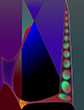
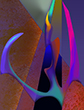
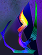
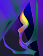
In summation, the combination of the various Hues, their various tints, tones, shades, various Temperatures, whether they are opposite or adjacent in some degree on the Color Wheel, their placement and area one to another in relation to each other and their various subtleties and intensities combined with the various Compositional Elements: Line, Shape, Form, Color, Value, Texture, and Space and Principles of Design and Composition: Harmony, Unity, Balance, Contrast, Visual Hierarchy, Negative Space, Focal Points, Alignment, Repetition, Pattern, Proximity, Proportion, and Movement, and the experimental applications of all these numerous Qualities and Quantities of Color Theory and Composition can be explored ad infinitum.
Color Experiment:
|
Over the past 48 years, an extensive diversity of artistic projects and commissions have afforded a vast exploration into design and composition. The most important being that of color. First, as a designer creating color comps for a national wallpaper manufacturer providing intense investigations into color harmony, intermixing of the cool and warm counterparts of each of the primary, secondary and tertiary colors, and applying The 3 C's of Art: Composition, Color, and Creativity. Second as an Artist/Designer of monumental stained-glass windows for national stained-glass studios whereby one obtained firsthand knowledge of the difference between the three primaries of pigment and the three primaries of light: RYB and RGB respectively. In pigment, which is subtractive, because mixing two or more colors together creates a progressively duller color, yellow and blue create green, one of the three primaries in light, which is additive, because mixing two or more colors together creates an ever more intense color, green and red light create yellow, one of the three pigment primaries, among the multifarious natural mysteries.
During the course of designing monumental, liturgical stained-glass windows, one acquired in-depth knowledge of both color and liturgical symbolism, as well as the psychological effects of color. Red conveying passion, blue symbolizing spiritual depth and calm, green representing rebirth and psychological neutrality, yellow expressing knowledge, understanding and piercing intellect, purple designating royalty, stature and nobility, orange, a vibrant color is associated with positive emotions like happiness, excitement, and warmth. It also symbolizes enthusiasm, energy, and playfulness.
Third, after experiencing the initial effects of RGB in colored light entering into the dark space of the interior of a church I was introduced to RGB on a computer screen.
During the 1980's my parents told me that I would one day need to learn how to use the computer. I said, "'why?' I'm an artist. I use paint, brushes, canvas, paper, glass. Why on earth would I ever need to learn how to use the computer?" In 1997 I enrolled at Bradley Academy for the Visual Arts to do just that. I was inducted into the ALPHA BETA KAPPA National Honor Society. I learned the quality of art produced with the computer is only as good as my traditional abilities with color, design, composition, and draftsmanship. Yes, it takes just as much dexterity to produce a work of art with a mouse as it takes with a pencil or paintbrush. In point of fact, it is more difficult to master the mouse as a drawing/painting instrument. And it takes a lot more technical knowledge to create with a computer.
As an 1977 honor graduate of Fine Art from the York Academy of Arts majoring in painting, I entered the field of stained-glass in 1979, designing and producing monumental stained-glass windows across the US. Over the past 48 years, I developed into a master Craftsman/Artist/Designer. I still draw in my sketchbooks, and paint with traditional painting materials although I have become fascinated with the applications of color the computer affords. In creating with the computer, as the computer screen emits RGB light, I am actually painting with light just as I was painting with light while painting scaled transparent lumiér stained glass designs. Therefore, light is an integral aspect of my creations.
|
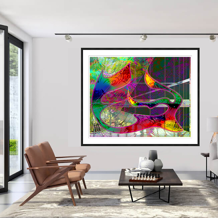
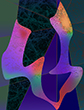
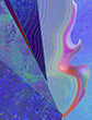
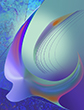
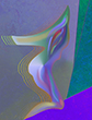
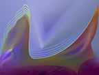
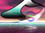
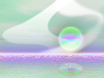
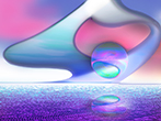
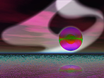
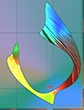
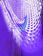
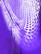
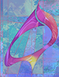
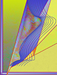
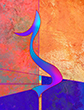
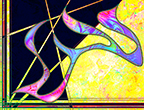
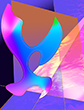
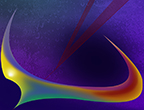
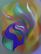
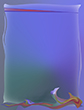
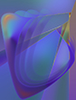
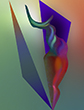
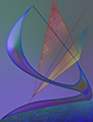
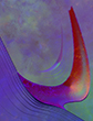
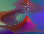
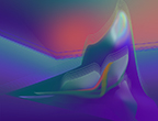
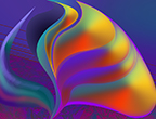
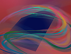
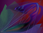
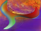
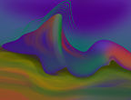
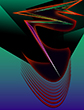
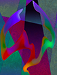
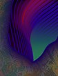
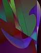
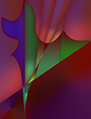
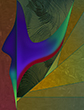
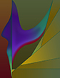
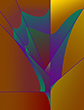
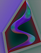
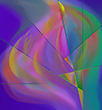
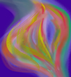
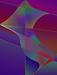
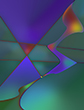
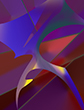
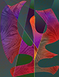
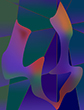
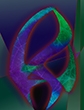
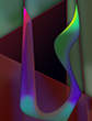
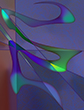
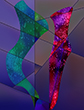
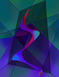
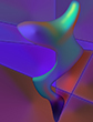
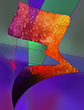
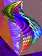
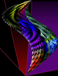
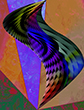
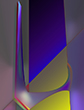
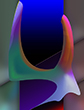
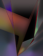
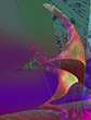
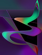
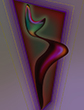
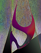
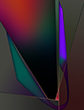
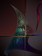
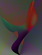
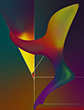
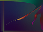
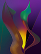
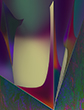
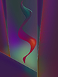
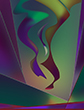
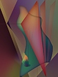
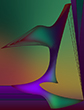
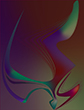
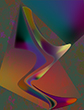
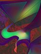
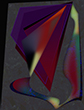
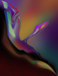
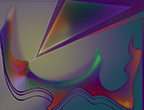
These works are in themselves "Metaphysical Symbols". Form and color are combined, united, and harmonized to create heartfelt impressions of life. The concept of inner radiating light plays an integral role in the development of these images. This light emanates from within a counterpoint of darkness and shadow. In some of these images, the light is radiating from without, almost hiding the shadow. In others, the light is hidden within the darkness and is virtually unseen. The light expresses all the positive forces of human nature: growth and expansion, the power of intellect, and most importantly, the power of transcendental love. The darkness elicits the dark forces of human nature: anger, resentment, hatred, complacency. Ironically, we cannot have one without the other. The darkness increases the beauty of the light, just as evil contrasting with benevolence enhances the joy one experiences by doing a good deed. It is an eternal paradox.
Unlike commercially photographed reproductions of pastel, watercolor, and oil paintings printed in Giclée that are no longer original works of art, but simple photographed reproductions and which are printed in mass by the hundreds or even thousands, the Digital Giclée Printed Paintings created by Curtis R Doll Jr are truly Limited Editions of 75 plus 5 Artist Proofs. They are Digital Paintings created on his computer as unique original works of art in this pre-eminent late 20th early 21st Centuries Medium. Once the 75th painting in each edition is printed, signed, titled, and numbered with Curtis' seal printed on them to distinguish them from pirated prints of inferior quality, all-digital .tif files used to print said series are securely deleted into cyberspace and exist no longer. Only a .jpg and a .psd file are retained for future reference. Each of these works of art is painted at full-scale image size 21" x 16" at 350 ppi resolution and reformatted to 300 ppi for printing. With the title, edition number, signature, and seal at the bottom, on a white one-inch border, they measure 23" x 18" or 18" x 23", depending on a vertical or horizontal format. Fine Art Museum Paintings are always exhibited with height before width. Each is accompanied by a Certificate of Authenticity.
Curtis's unique digital creations are classified as paintings due to their individual craftsmanship and artistic complexity. Created with a
computer mouse, each piece showcases a wide spectrum of colors, linear and textural effects, and subtle blending techniques, setting them
apart from standard flat art prints. The artist's mastery of the mousea tool often considered more challenging than a brush or pencilis combined with a high degree of technical expertise. This innovative late 20th-century Giclée Printed Painting Technique expands the boundaries of fine art with virtually limitless creative possibilities.
Giclée (pronounced Gee'clay) is a French term meaning to spray, which is how an inkjet printer works. However, it is not the same as a standard desktop inkjet printer, and is much larger and more detailed. Giclée prints can be a little over a meter wide and are printed on high quality archival papers with a maximum image size of 58" x 70". Giclée is the best way to produce detailed, high-quality archival limited editions of digital fine art and photography.
Only brand name, special light-fast pigment inks are used. There are 12 colors, together achieving every possible highest saturated
color and color subtlety in existence. These inks are archival certified and if treated properly, will last more than a lifetime. The paper used is 100% acid free archival rag which means the pigment inks and paper will last for lifetimes and can be handed down from generation to generation.
Curt has been a professional, working artist since 1977.
© 2025 CurtisGraphics All Rights Reserved
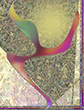
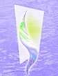
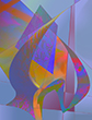
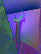
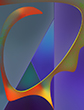
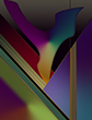
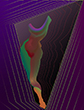
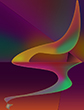
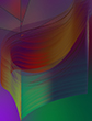
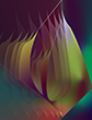
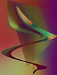
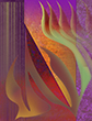
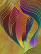
The Lark Ascending
On-line Awards
a love letter
The Lark Ascending
Out of abyss emerges the matrix
Primordial egg of existence
Diaphanous womb of our universe
Permeated by luminous power of celestial origin
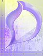
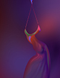
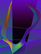
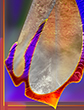
Tempest is released from its fetters
Instantaneous collisions of energy thunderclap
Pristine semina of duality take their stance
Origin of diversity begins
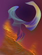
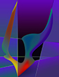
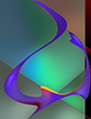
Mirror of endless contemplation crystallizes
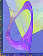
As the chrysalis manifests itself
An entity of reflection,
Of spiritual longing takes form
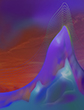
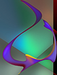
Olamic metamorphosis impels cyclical inertia
Causation begins
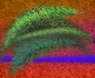
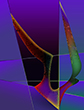
Entrails of the nucleus expand and
Break apart releasing the monad
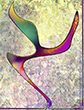
The lark ascends
An ecstatic paean issues forth
Venerating innocence with increasing charm
As resonance illumines Lydian Measures
The lark sojourns
Till elixirs of lengthening vigilance overflow
Then resumes its journey
Curt Doll
(After the Musical Composition
by Ralph Vaughan Williams)
The Lark Ascending music by Ralph Vaughan Williams was composed in 1914 and revised in 1920. A musical composition for solo violin, The Lark Ascending is described as a pastoral piece depicting pre war England. However, taking into account the spiritual depth of his symphonic music, I personally perceive The Lark Ascending to evoke a deeper longing for the discovery of ones own inner being.
As a graduate of Fine Art from the York Academy of Arts in 1977, I have been a lover of fine music, art and literature all of my life. The Lark Ascending Poem was inspired by the sublime violin composition by Ralph Vaughan Williams. It is my intention to reveal the interconnectedness between the arts; music, poetry and visual art by incorporating visual images along with this poem. The imagery and the poem are best appreciated when viewed and read while listening to the music.
Ballet is implied by the final line in the poem.
2002 "The Lark Ascending" Poem was included in the International Library of Poetry Anthology: "The Solace of Night" Published by Watermark Press, One Poetry Plaza, Owings Mills, MD 21117
This site has won the 2004 "World Web Award of Excellence" for
originality, overall design and appearance, ease of navigation, and content.
Presented by
The International Association of Web Masters and Designers
In recognition of creativity, integrity and excellence on the Web.
The Art Academy of Paris, in partnership with artcult.com,
has voted to honour this site with its award of excellency.
All images on these pages are copyrighted
© 2025 CurtisGraphics all rights reserved.
 |
|