Johannes Itten's Seven Contrasts of Color with notes from Cézanne
Light and shade are a relation of colors; the two principle accidentals differ not by dint of their general intensity, but rather their own specific sonority. Color is a silent visual vibration just as musical notes are audible vibrations.
Let us read nature; let us realize our sensations in an aesthetic that is at once personal and traditional. The strongest will be he who sees most deeply and realizes fully.
Painting from nature is not copying the object, it is realizing one's sensations. There are two things in the painter, the eye and the mind; each of them should aid the other. It is necessary to work at their mutual development, in the eye by reading nature through honing one's perception of the multifarious nuances of color, in the mind by the logic of organized sensations which provides the means of expression. To read nature and perceive color is to see it, as if through a veil, in terms of an interpretation in patches of color following one another according to a law of harmony. These major hues are thus analyzed through modulations. Painting is classifying one's sensations of color. There is no such thing as line or modeling; there are only contrasts. These are not contrasts of light and dark, but the contrasts given by the sensation of color.
Modulation is the outcome of the exact relationship of colors. When they are harmoniously juxtaposed and complete, the painting develops form of its own accord. One should not say model, one should say modulate. Shadow is a color as light is, but less brilliant; light and shadow are only the relationship of various colors. Warm colors come forward while cool colors recede. Warm colors placed on the convex area of a body and cool colors placed on the receding shadow side of a form create an object as seen in depth.
Everything in nature is modeled on the sphere, the cone, the cylinder, and the cube. One must learn to paint from these simple forms; it will then be possible to do whatever one wishes. Drawing and color are not separate at all; in so far as you paint you draw. Black, White, and the Gray Scale are also colors. The more the color harmonizes, the more exact the drawing or painting becomes. When the color achieves richness, the form attains its fullness also. The contrasts and connections of color - there you have the secret of drawing and painting and form.
The effect is what constitutes a painting. It unifies a painting and concentrates it. The effect must be based on the existence of a dominating patch of color. It is necessary to be workmanlike in art. To get to know one's way of realization early. To paint in accordance with the qualities of painting itself. To use materials crude and pure. It is necessary to become classical by way of nature, that is to say through sensation. — From Cézanne's Philosophy on Aesthetics.
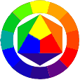
I adhere to the Seven Contrasts of Color as put forth by Johannes Itten (November 11, 1888, Südern-Linden, Switzerland - March 25, 1967, Zürich, Switzerland) who was an instructor at the Bauhaus.
- Seven Contrasts of Color
- Hue Contrast: Observed differences designated by name such as Red, Yellow, Blue, Green, Orange, Violet, etc. The Contrast of Hue is the pure, base family of a color (such as red, yellow, or blue) without the influence of tinting (white) or shading (black) or by the intermixing of the other two primaries. In this seminal work, The Art of Color (1961), Itten treated hue as one of the seven key contraststhe contrast of huewhich is most vivid when using pure, saturated colors.
Itten developed a 12-hue color wheel, which is the foundation of his color theory, aiming to visualize the relationship between primary, secondary, and tertiary colors.
Primary Colors (Triangle): Red, yellow, and blue are placed at the center as an equilateral triangle.
Secondary Colors (Hexagon): Orange, green, and violet are created by mixing two of the primaries in equal proportions and placed surrounding the triangle.
Tertiary Colors (Outer Circle): Six intermediate colors (yellow-orange, red-orange, red-purple, blue-purple, blue-green, yellow-green) are created by mixing a primary and secondary color.
Itten identified the "contrast of hue" as the most straightforward of his seven color contrasts, produced by the juxtaposition of different, distinct colors.
The most powerful expression of this contrast occurs with pure, primary colors (Yellow/Red/Blue). The contrast becomes less intense as the hues move further from the primary triad toward secondary and tertiary colors. It gives a sense of power, grandeur, and vitality to art.
Itten, who was influenced by Expressionism and spirituality, viewed color beyond just a physical property. He believed colors hold an emotional, spiritual, and psychic value, expressing inner temperament. In "Children of Light": Itten wrote, "Colors are the children of light, and light of their mother". While he taught objective color laws, he believed artists must feel and experience colors intuitively. Ittens work is characterized by an emphasis on color harmony, the 12-hue circle, and the idea that color should be a liberating spiritual force.
- Value Contrast: Light to Dark. The range of Black through the Gray Scale to White or any color tinted with White or toned with White and Black or Shaded with Black. Gradation is a beautiful use of this contrast but it is also applicable using the other 6 contrasts. It is preferable to use more White abstaining from using Black to achieve a more luminous color palette. Some artists have refrained from using Black altogether preferring the intermixing of the three primaries (Red, Yellow, Blue) to achieve a Dark, almost Black Gray. However, Franz Kline used Black and White almost exclusively to aclieve the most wonderful, powerful abstract gestural paintings in existence.
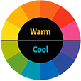
- Temperature Contrast: Cool to Warm Colors or Cold to Hot Colors, ex., (Cool Red-Violet to Warm Yellow-Green) — (Cold Blue to Hot Orange). Warm colors come forward while cool colors recede. Warm colors placed on the convex area of a body and cool colors placed on the receding shadow side of a form create an object or abstract form as seen in depth. A hot Orange shape placed on a cold Blue field is perhaps the strongest, most intense color contrast of all because it not only is the hottest-coldest temperature contrast it also is a complementary contrast. Blue and Orange represent the strongest contrast in color temperature, acting as a fundamental, complementary pair that pits the "hottest" tones against the "coldest". In this spectrum, Orange is recognized as the hottest color, often linked to heat, fire, and the energy of a setting sun, while Blue is considered the coldest, evoking ice and water.
- Complementary Contrast: Opposites on the Color Wheel —
the most intense color contrast. There are 3 primary colors on the color wheel; (Red, Yellow, Blue). These 3 are the purest of all colors; no colors can be mixed to create any of these 3 colors and in fact, all other colors on the color wheel are produced by mixing 2 of these 3 together. — All color harmony hinges on this; remove 1 of the 3 primary colors, Red, Yellow, Blue, ex., (Red) isolated from the opposing complementary combination of remaining 2 primaries, (Yellow and Blue when mixed resulting in Green, the complement of Red) and with intermixing of White into all of these color combinations results in a broad range of Color Hues, Values, Temperature, Simultaneous, Saturation and of course the Complementary Contrast, indeed the main applicable color contrasts. The Complements Blue - Orange are the most intense Temperature Contrast, the Complements Yellow - Violet are the most extreme Value Contrast on the color wheel, and the Complements Red - Green are, perhaps, the most intense Contrast in Vibrance, possibly because they are the same in Value, and the 3 primaries Red, Yellow, Blue are the most intense Hue Contrasts. The 3 secondary colors are Orange, Green and Violet resulting from the equal mixture of 2 of the primaries; (Red and Yellow = Orange), (Yellow and Blue = Green), and (Blue and Red = Violet). The 6 tertiary colors and their Complements are (Yellow-Orange — Blue-Violet), (Red-Orange — Blue-Green), (Red-Violet — Yellow-Green) which result from the named primary being dominant in the mixture of the 2 primaries.
- Simultaneous Contrast: When colors affect each other Simultaneously in different regions of the color wheel, in such a way that they both appear to become more pronounced affecting each other at once. It refers to the way a color appears to shift in Hue, Value or Intensity when placed next to another color. A small neutral gray square of the same Value placed on top of a larger square of any of the pure colors in the color wheel appears to lean toward the complement of the pure color upon which it was placed. A muted Red like Burnt Sienna with a smaller muted Gray-Green patch placed on top of the Burnt Sienna Simultaneously increases the optical chroma of both the Red in the Sienna and the Green in the Gray-Green. Michel Eugene Chevreul first postulated this phenomenon of Simultaneous Contrast of Colors during the lecture he gave on this subject at the French Academy of Sciences on the 7th April, 1828.
- Successive Contrast: Happens in the brain of the viewer when one stares at a Saturated color for a while and then looks away, the opposite color on the color wheel appears in a sort of visual mirage in the same shape and size. This occurs because the photoreceptors in the eye become fatigued, causing the brain to compensate by producing the opposite hue.
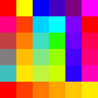
- Saturation Contrast: Intense Color to Muted Color; the intermixing of all colors from the most intense being the highest in Saturation, to the most subtle, being the least Saturated. The intermixing of all three primaries results in a desaturated, almost Black Neutral Gray. When one or two of the primaries are in higher quantity, the Gray becomes a Reddish Gray with a higher degree of Red; or Bluish Gray with a higher degree of Blue; or a Violet Gray with a higher degree of Blue and Red mixed with the Yellow. Further, mixing White with all three primaries in varying proportions produces a huge variety of subtle colors, including Red-Gray, Yellow-Gray, Blue-Gray, Orange-Gray, Green-Gray to Violet-Gray in all their various tints, tones, shades, and Saturations ad infinitum. A more concrete and elucidating example is Salmon; resulting from 52% Red, 36% Yellow, 12% Blue. This contrast also requires the greatest effort in honing one's skills in the mixing of colors and requires the greatest degree of observational acuity. When mixing colors, it is necessary to have two versions of each of the three primaries; a warm version and a cool version: Cadmium Red and Magenta Red; Cadmium Yellow and Lemon Yellow; Cerulean Blue and Ultramarine Blue, respectively. - Cad. Red mixed with Cad. Yellow creates an intense Orange. Cerulean Blue mixed with Lemon Yellow creates an intense Green. Ultramarine Blue mixed with Magenta Red creates an intense Violet. - Cad. Red and Cerulean Blue create a muted Gray Violet. Cad. Yellow and Ultramarine create a dirty muted Green. Lemon Yellow and Magenta create a muted Burnt Orange. While these colors are preferred under certain circumstances, there are times when the purest secondary and tertiary colors are preferred and or required. I even have both versions of the secondary and tertiary colors. And an extra-large tube of white is always a prerequisite.
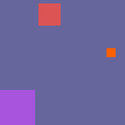
- Extension Contrast: Contrasts of proportion and placement of colors in spatial relationships, and Focal Point(s) optically inducing movement. Itten used Goethe's theories to explain how the area of a color can influence its perceived strength. A dominant color is the one that appears in the largest area and influences the overall feeling of the piece. It refers to the balance of colours in proportion to their intensity, placement, and area, as well as to Quality and Quantity in color theory.
An example of Focal Points is starting with a Cool Bluish Gray field upon which are placed a large Light Lilac square at the bottom left - a medium-sized Light Red square placed at the top left just off center, and a small Brilliant Orange square placed just above the horizontal center to the far right. The Blue Gray field is the dominant color because it occupies the largest area. But the Brilliant Orange does 2 things. Being the Complement of Blue, the Blue Gray Simultaneously appears to be a more intense Blue surrounding the Orange and the Orange Simultaneously appears to be even more intense relative to the Blue Gray. Being the strongest color contrast, the eye immediately focuses on the small Orange square as that is the main focal point. Next, the eye will move up to the Light Red square and finally down to the Lilac square, their placement inducing movement.
Extension-Saturation-Focal Points:
The Quality of a color refers to the intensity or purity of a Hue. It describes how vivid or dull a color appears, indicating how much of the other two primaries it contains. Higher Quality means a more intense, vibrant color, while Lower Quality indicates a duller, more muted tint, tone or shade. In Color Theory, the Quantity of a color is understood through three primary attributes: Hue, Saturation, and Value. Hue refers to the pure color (e.g., Red, Yellow, Blue). Saturation describes the intensity or purity of a color, while Value indicates how light or dark a color is. A Bright Red has a high Quantity of Red Saturation, while a Pale Pink has a lower Quantity of Red Saturation. And a Light Blue has a higher Value (Quantity) than a Dark Navy Blue. These three attributes, when considered together, define the overall Quantity or appearance of a specific color. In essence, while Hue is the basic color, Value and Saturation determine the specific character and Quantity of that color in a work of art.
- The first comprehensive color wheel, a foundational tool in color theory, was developed by Sir Isaac Newton in 1666, based on his experiments with light and prisms, which revealed the spectrum of colors. Then, down through the ages, further scientific observations developed greater understanding into the optical appreciation of color with more in-depth psychological and symbolic nuances of color theory.
While Newton's work laid the groundwork, other scientists and artists, such as Johann Wolfgang von Goethe, Moses Harris, and Johannes Itten, further developed and refined the concept of the color wheel.
Michel Eugene Chevreul (August 31, 1786, Angers, France - April 9, 1889, Paris, France) was a leading chemist during the 1800s in France and was the greatest living authority on animal fats. His chemical investigations also included research in coloring materials. At the age of 38 in 1824, he was named by King Louis XVIII, Director of Dyes for the Royal Manufactures of Tapestries at the Gobelins in France.
Michel Eugene Chevreul (1839) wrote the seminal work on color theory: De la loi du contraste simultané des couleurs et de l'assortiment des objets colorés (On the law of simultaneous contrast of colours and the assortment of colored objects), translated into English by Charles Martel as The principles of harmony and contrast of colours (1854). This work focused on the principle of Simultaneous Contrast of Colors. In 1855, M. E. Chevreul modified his work and renamed it "The Principles of Harmony and Contrast of Colours, and Their Applications to the Arts" (2nd ed.). This work influenced the impressionist Claude Monet in 1874. Other artists influenced by this work are Georges Seurat & Neo-Impressionists, Robert Delaunay & Orphism, Frantiek Kupka, Camille Pissarro, Vincent van Gogh, and other subsequent artists, and remains pertinent in the realm of color theory to this day.
Light and shade are a relation of colors; the two principal accidentals differ not by dint of their general intensity, but rather their own specific sonority. Color is a silent visual vibration just as musical notes are audible vibrations. The form and contour of objects or abstract forms are given to us by those oppositions and contrasts which result from their particular colorations. Pure drawing is an abstraction. Drawing and color are not distinct, everything in nature is colored. Black, White and the Gray Scale are also colors. Insofar as one paints, one draws. Accuracy of color establishes both light, modeling, and form for an object or abstract form at the same time. The greater the harmony of color, the greater the precision of the drawing or painting. Contrasts and relations of colors, - there lies the secret of drawing and painting.
Nature exists in depth. Between the painter and his model exists a plane - atmosphere. Bodies perceived in space are all convex. Atmosphere forms the unchanging background, a screen on which all oppositions of color, all accidentals of light dissolve. It constitutes the atmosphere of the painting by contributing to its synthesis and general harmony.
One can say therefore that to paint is to contrast and in using the many contrasts of color, elements and principles of design, to compose. There is neither light nor dark painting, only relations of colors. When these are applied with precision, harmony is immediately established. The more numerous and varied they are, the greater the effect and the more pleasing they are to the eye. Painting, like any art, comprises a technique, a workmanlike handling of material, but the accuracy of color, and the felicitous combination of effects depend entirely on the choices made by the artist. The artist does not perceive every relation directly: he senses them. Painting is the art of combining effects, that is to say establishing relationships among colors, contours and planes. Method is clarified through contact with nature and the development of acute perception of the innumerable nuances of color. It develops through circumstances. It consists in the search for a way of expressing how one feels, in the organization of these feelings into a personal aesthetic. To look upon nature is to discern the character of one's model or conception. Painting does not mean slavishly copying the object: it means perceiving harmony amongst numerous relationships and transposing them into a system of one's own by developing them according to a new, original logic. To make a painting is to compose.
In summation, the combination of the various Hues, their various tints, tones, shades, various Temperatures, whether they are opposite or adjacent in some degree on the Color Wheel, their placement and area one to another in relation to each other and their various subtleties and intensities combined with the various Compositional Elements: Line, Shape, Form, Color, Value, Texture, and Space and Principles of Design and Composition: Harmony, Unity, Balance, Contrast, Visual Hierarchy, Negative Space, Focal Points, Alignment, Repetition, Pattern, Proximity, Proportion, and Movement, and the experimental applications of all these numerous Qualities and Quantities of Color Theory and Composition can be explored ad infinitum.
From Cézanne's Artistic Philosophy and Itten's The Elements of Color.
Color Experiment:
Introduction | Pricing Policy | Commissions Policy | Returns Policy | Privacy Policy | Fraud Alert
gallery 1 | gallery 2 | gallery 3 | gallery 4 | gallery 5